
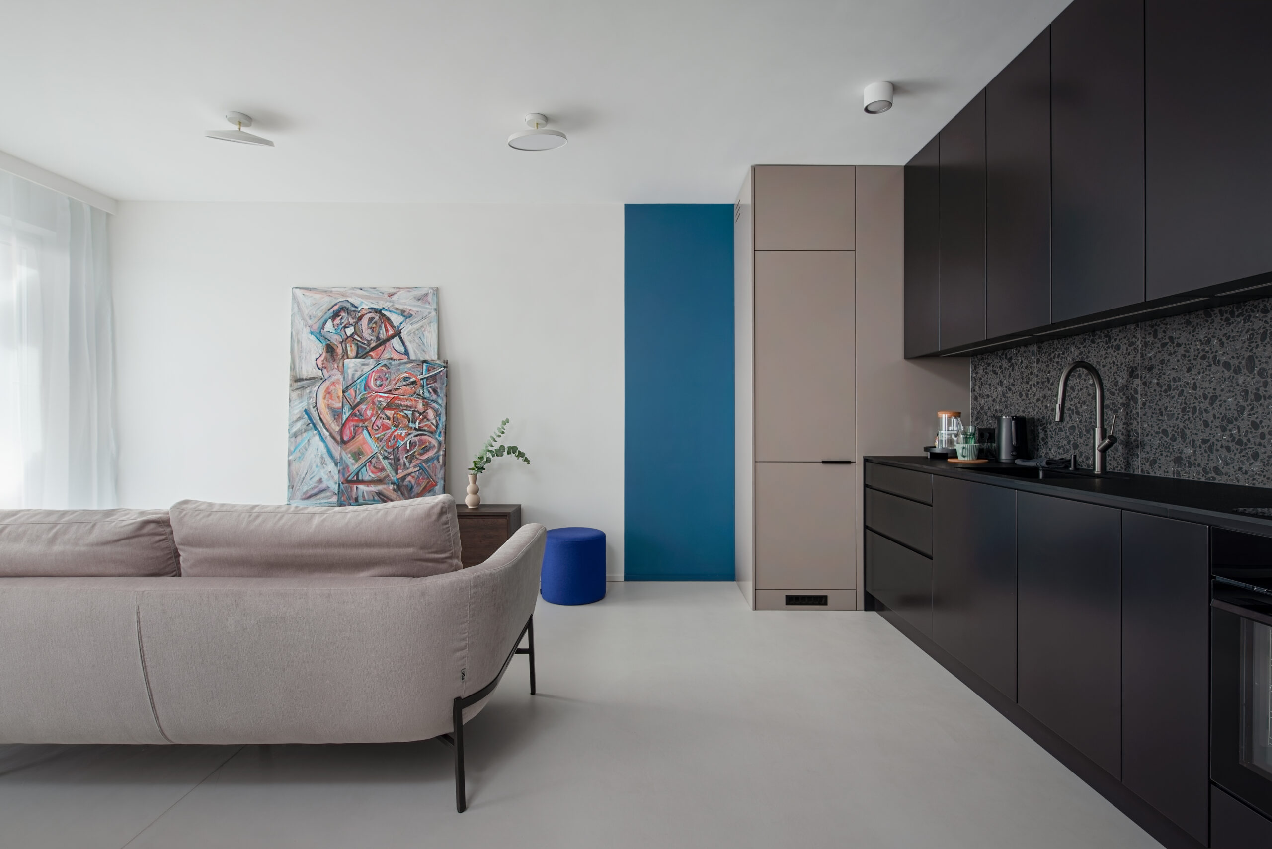

Last summer a client called to say her gloomy north‑facing flat suddenly felt calm, brighter and “finished” after we swapped a harsh white for a warm greige microcement and echoed it across floors and a feature wall—proof that colour, not just product, transforms space. In this guide we’ll chat through how to pick microcement hues that play nicely with your architecture, landscape and furnishings, build simple, balanced schemes for indoors and out, and use light, LRV and undertones (plus Kelvin temps) to your advantage. You’ll get room‑by‑room palette ideas with real‑world codes, quick rules for UV, heat and glare outdoors, and tips on finishes, textures and sealers that subtly shift tone. We’ll also cover smart sampling, pairing with metals, woods and stones, and low‑stress maintenance so your chosen colour stays consistent. Think practical examples, bite‑size rules and visual pointers—so you can choose confidently and create cohesive, durable surfaces that look considered in every light.
Microcement Colour Strategy for Interiors and Exteriors
Microcement colour choices should sync with the project’s architecture, landscaping and surrounding materials—think timber, metal, and stone. Indoors, aim for a calm backbone that flatters furniture and lighting; outdoors, weigh UV stability, heat absorption and glare control. Dark shades on terraces will run hotter and highlight dust; ultra-light tones can be blinding at noon; mid-tones hide footprints and water marks better. Use the 60–30–10 rule to keep it clean and intentional: 60% base colour for floors/walls, 30% secondary tone for joinery and features, and 10% accent in fixtures or soft furnishings. Pair microcement with adjacent materials by matching undertones: warm greys with oak or brass, cooler greys with stainless or basalt, earthy neutrals with limestone or clay textures for cohesion without trying too hard.
– Urban flat (north-facing): Base warm greige (60%) for depth in low light, Secondary charcoal (30%) on shelving or kitchen fronts, Accent brass (10%) in handles and lamps. Visual cue: a single hero shot framing the greige field, charcoal edge, brass pop.
– Coastal home: Base pale sand (60%) to balance daylight, Secondary driftwood taupe (30%) on stairs or vanity, Accent sea‑green (10%) via textiles or tapware. Visual cue: one image calling out the three tones for clarity.
– Garden patio: Base mid‑grey (60%) with a high‑UV sealer for endurance, Secondary off‑white walls (30%) to bounce light without glare, Accent terracotta pots (10%) for earthy contrast. Visual cue: single frame naming the palette.
Pro tips: test swatches in real light; specify anti‑slip microcement sealers for exterior steps; keep LRV mid-range outdoors to balance heat and reflectance; and repeat the accent colour at least twice so it feels deliberate, not random.
Using Light, LRV and Undertones to Choose Microcement Colours
If you want your space to look intentional rather than accidental, start by reading the light like a pro: check room orientation (north is cooler, south is brighter), note the Light Reflectance Value (LRV), clock the undertones (warm/cool/neutral), and test under real artificial lighting at 2700–4000K. North-facing rooms often wash hues icy; south-facing spaces can exaggerate yellow. Low LRV closes a space down; high LRV bounces light and can highlight every speck of dust. Keep it simple: pick a target LRV, pick an undertone that flatters the light, and then sample it at two Kelvin points to see how it behaves. If it looks dull at 2700K and jittery at 4000K, it’s the wrong shade for that room.
- Walls in dim rooms: aim for LRV 60–75 to lift the space without glare; skip stark whites that can skew grey-blue and feel clinical.
- Floors: choose LRV 35–55 to disguise dust and footprints; remember, darker reads smaller and cosier, lighter feels more open and airy.
- Wet rooms: target LRV 45–65 so you balance brightness with slip-visibility and avoid blinding reflections on damp surfaces.
- Orientation rule: north light loves warm undertones (Y, YR); south light can handle cooler families (N, B) without going flat.
- Undertone picks you can actually specify: – Warm greige: RAL 7044 or NCS S 2002-Y (adds softness in cold light). – Soft taupe: RAL 1019 or NCS S 3005-Y20R (earthy, calm, great for living areas). – Cool grey: RAL 7047 or NCS S 1500-N (clean backdrop for south-facing rooms). – Charcoal: RAL 7021 or NCS S 7502-B (moody, grounding for feature walls and floors).
- Visual tip: line up a simple swatch row and view it under 2700K (warm) and 4000K (cool); label the Kelvin values so you can compare shifts in undertone at a glance.
Room-by-Room Microcement Colour Ideas and Palettes
Function dictates the palette — treat microcement colour choices like a toolkit, not a mood board. In bathrooms, lean into humidity-smart tones that won’t shout against steam and tiles; kitchens need hygiene-forward, stain-tolerant bases; halls and staircases demand wear-masking contrast with safe visibility; living rooms and bedrooms call for a balance of calm versus energy without glare. For stairs, build in slip-awareness via tonal contrast so edges read instantly. Below are crisp, actionable palettes that pair microcement base tones with materials and finishes that actually behave in real homes — no fluff, just workable colour strategies with proven codes.
| Room | Base Tone (Microcement) | Pairing Colour | Why It Works | Example Codes |
| Bathroom | Warm light grey | Matt black brassware | Softens cool tiles; hides limescale | NCS S 2000-N + RAL 9005 accents |
| Kitchen | Mid greige floor | Deep green cabinets | Grounds spills; adds depth | NCS S 3502-Y + RAL 6007 |
| Living | Pale oatmeal | Natural oak | Bright yet cosy; daylight-friendly | NCS S 1505-Y20R + Oak |
| Bedroom | Mushroom taupe | Soft clay textiles | Restful warmth; low glare | RAL 1019 + muted linens |
| Hall/Stairs | Graphite treads | Off-white walls | Scuff-masking; safe contrast | RAL 7021 + RAL 9010 |
| Terrace | Mid stone grey | Terracotta pots | UV sensible; dirt-forgiving | RAL 7040 + Terracotta |
Micro-tips for a joined-up scheme:
1) Run one base tone through key zones to avoid a patchwork vibe.
2) Repeat a single metal finish (brushed nickel, matt black, or aged brass) for visual continuity.
3) Limit accents to two hues across the whole home to keep the microcement looking intentional, not noisy.
Finishes, Texture and Sealers: How They Change Microcement Colours
Finish, texture and sealer choices can flip a scheme from crisp to moody in a heartbeat. Matt reads lighter and flatter, great for minimal, gallery-like spaces, while satin deepens colour and makes mottling pop—think richer depth and a touch of drama. A heavier trowel texture darkens and adds movement with visible flow lines; a fine polish looks cleaner and more architectural. Anti-slip topcoats often introduce a gentle haze that cools the tone, softening warmth. With sealers, solvent products can amber on whites, nudging them cream, whereas water-based sealers keep neutrality and protect the original hue. Quick checks before committing: prepare side-by-side samples using the same pigment in matt vs satin under identical light; include a close-up of trowel direction (vertical vs random) to see tone variance; and note that a wet-area topcoat can deepen colour by 5–10%—plan for that shift so edges and adjacent materials don’t clash.
Where to use what for reliable results: on floors, go satin or hard‑wearing matt with a medium texture for traction and a colour that won’t telegraph every footprint. On shower walls, specify a water‑based matt to keep hues crisp, adding anti‑slip only on trays. For feature walls, choose a finely polished matt to reduce glare bands and keep the tone even in changing daylight. Case study: in a coastal apartment, a pale grey floor sample looked chalky in matt but gained depth and nuanced mottling with satin, while the shower enclosure kept its neutral grey by switching to a water‑based sealer. Another project—an office reception—used a vertical trowel pattern to intentionally darken and elongate the space; the identical pigment applied randomly read lighter and calmer in the adjacent meeting room. These small, controlled choices are where colour performance is won or lost.
Sampling, Pairing and Maintenance: Keeping Microcement Colours Consistent
Control the colour before it controls the room. Here’s the no‑nonsense workflow that stops regret at install day. 1) Create A4 boards of your top three pigments using the exact build‑up you’ll use on site—base, microcement layer, and chosen sealer. 2) Check in changing light: morning, noon, evening; then swap bulbs (2700K vs 4000K) and note shifts in warmth or greyness. 3) Pair against real materials: set boards beside worktops, tiles, timber, fabrics, and metal finishes. 4) Lock one colour system‑wide and order pigment from a single batch to avoid drift. For pairing, match undertones: warm schemes sing with brass/bronze, cooler ones look razor‑clean with chrome/black. On skirting and trims, go two steps lighter or darker (aim LRV shift 10–15) for crisp edges that frame walls instead of muddying them. Care is simple: clean with pH‑neutral soap; avoid bleach, vinegar, and steam. Protect floors with mats and felt pads; wipe spills fast (coffee, wine, hair dye). Re‑seal high‑traffic zones every 18–24 months and expect a subtle deepening after sealing—plan your target shade with that in mind.
Case studies that save headaches. Residential loft: a client fell for a cool grey on a phone photo; our A4 boards showed it skewed blue under 4000K kitchen spots. We pivoted to a neutral‑warm undertone, paired with brushed brass and a two‑step lighter trim (LRV +12) for definition—result: zero clash with oak. Boutique salon: pale greige walls looked perfect at noon but dulled under evening LEDs; a mid‑tone with higher LRV and a silk‑matte sealer kept depth without glare, and scheduled re‑seal at 18 months handled dye splashes. Visual tip for every project: build a 6‑tile swatch grid—two lights, two mids, two darks—each labelled with LRV, undertone and finish (matte/satin). It’s the portable truth meter that keeps microcement colour consistency across rooms, contractors, and lighting quirks.